Week 12: Open Studio
An important week of preparation for Viva, Open Studios provides us the opportunity to display our works.
With a rough table setup, we'll be able to check for any lack of critical information and to get vital feedback from industry experts.
Setup and Display
Day 1
There weren’t a lot of people who came to check out my work. People were more drawn towards Nora’s table. Rightfully so because she has more printed material to flip through and visually was more colourful!
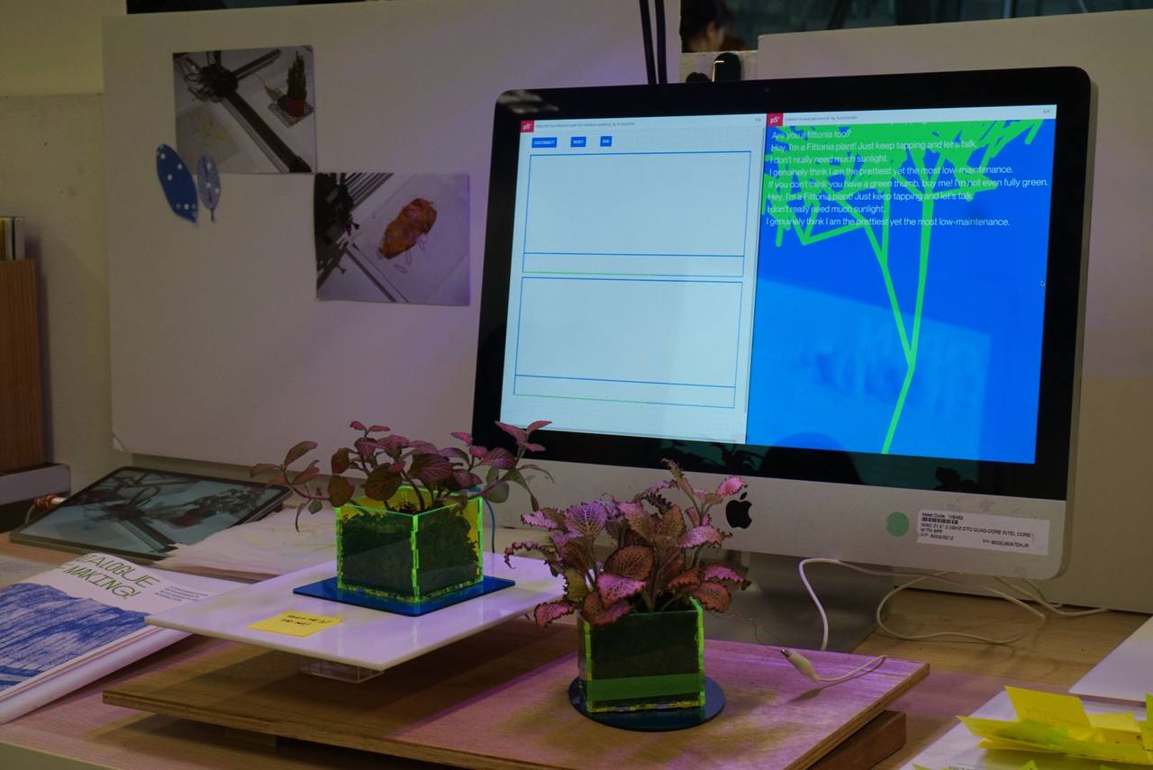
Aditi’s table was also quite active as people were encouraged to interact with her plants. I think for tomorrow I’ll probably add the interactive prototype so people will be drawn into the space. I’ll need to figure out how to get the servo motors to work for as long as the current setup works for like a minute before starting to stutter.
Day 2
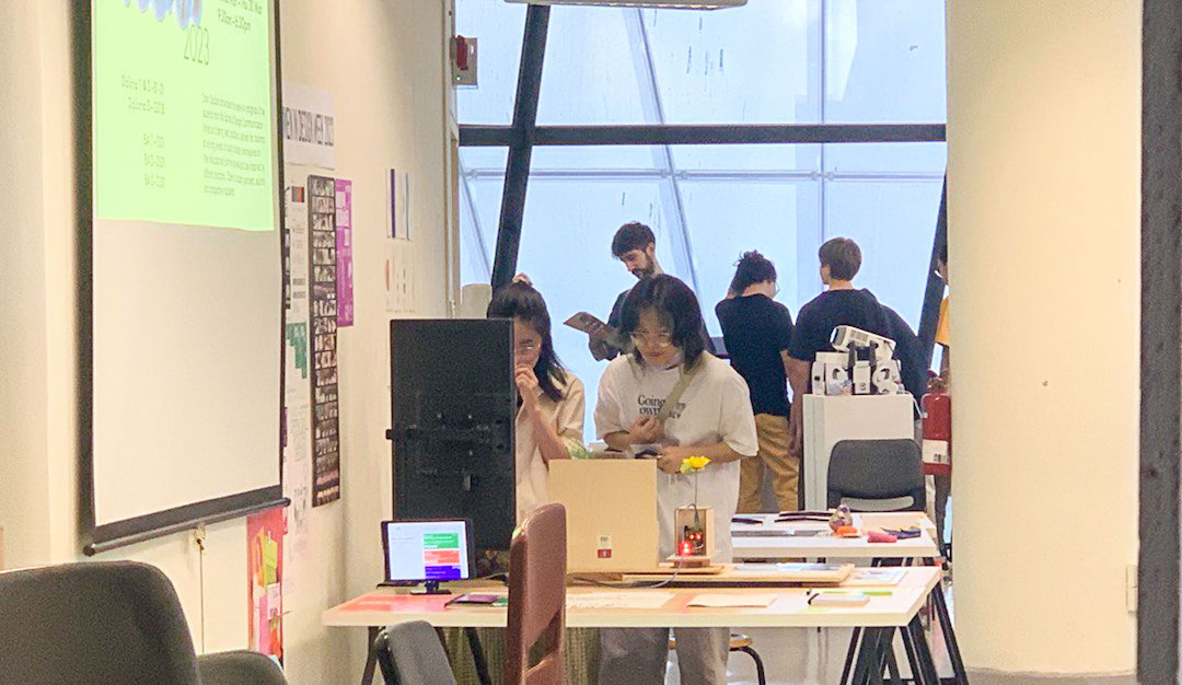
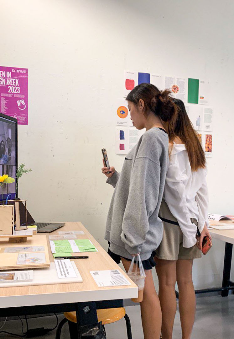
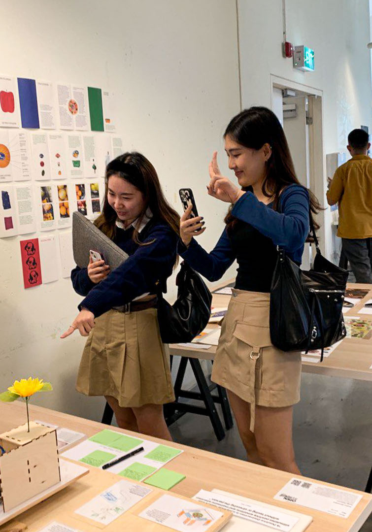
I went to get another arduino uno to setup the interactive segment, glad I didn’t have to pay $45 for the original manufactured board but just $20 for the OEM. Anyway now I really can’t use my laptop for work cos the code needs to run along with the webcam but at least people are coming to see themselves on the screen. It’s funny cos it feels like those dedicated Instagram spots that people go to during exhibitions.
I’m quite happy to see people interacting with the booth in that sense but I wonder whether I would need to strongly consider having the screen up for the final ‘product’ and Viva Voce exhibition. Actually not much of an issue for Viva, as that would mean I package the whole experience to include the screen; but more importantly for Grad Show it’d probably mean it’d be a good idea to think of how I can have the interaction occur without leaving my laptop out there for the whole month.
Day 3
The most hectic day, since it’s the last one. Suddenly everyone wants to be in the room from industry experts to students from different courses. But it was the most fun one since the guys from MAL came down to check out on things, mainly to say hi and look for a potential copywriter hire, but got a bunch of feedback from them!
Collating Feedback
As part of the display, I had a 4-quadrant feedback form similar to how Andreas had previously conducted class feedback sessions. It was effective in getting feedback as people took their time to interact with the artefacts and write their opinions down immediately.
What works?
A practical yet sophisticated piece of work. Successful at illustrating interactivity with using emotion as translation.
Love the aspect of repetition as a tool to help calm.
I really love the shadows casted from the acrylic panels and how seamless the motion seems! I also liked that the artefacts are triggered with happy expressions because i think i read somewhere that smiling/laughing when you’re stressed actually lifts up your mood!
Love that the artefacts encourages this and gives the people a reason to smile 🙂
The plant response was quite obvious to me and it made me focus on how to interact with it next. Very cool. I think it worked pretty well on the “distraction” factor.
What could be better?
Really really fun inspiring project. Remember, simplify simplify.
Art Direction: I think feels very neutral at the moment which could work in a hospital setting, but maybe lean into that ‘stress-free’ aspect a bit more; font wise, something flowy but not too decorated(?)
Prototypes: Loved the acrylic versions. Can imagine having fluorescent light filtering through as well and creating these colourful reflections. Would calm me down.
The movement that happens during the ‘happy’ felt abit frantic to me instead of celebratory — also I really like how the flower one moves.
Is there a way to make the artefact with the weed have no sound as it is moving? To me it feels a bit (negatively) distracting.
What’s missing?
Add colour.
Hospital ambience sound playing in the background?
Would love to see scaled up versions/larger quantities of the artefact because I think it would have a bigger impact and looks cute.
Would be nice if people get a small note about how the plant has reacted to them.
Would you interact with this if you were in a hospital waiting room?
Yes: 6
No: 0
A Good Week

Overall an enjoyable 3 days of showcase that was really helpful to practice the presentation for Viva as repeatedly explaining the project slowly revealed missing links, emphasised otherwise overlooked points and generally streamlined the oral pitch but quite a margin.
An example of an overlooked point was what inspired the project. I found myself pointing towards a small text cutout that had my reader and the main definition of ‘Positive Distraction’. I should make that into a key visual so that viewers get the immediate understanding of what the project entails.

Additionally, I found myself verbally sharing that parts of ‘Positive Distraction’ that was covered by readers were ‘Moving Greenery, Moving Water and Live Animals’ which helped to transition the presentation straight into the artefacts. This was not present in any printed material.
Lastly, the vision for how the artefacts would work in tandem with each other was displayed on a small scale sketch. Pointed out by others, this was an important element of the presentation to be shared as it reveals how the individual small artefacts, designed as modules, were expected to work together into a bigger ecosystem.
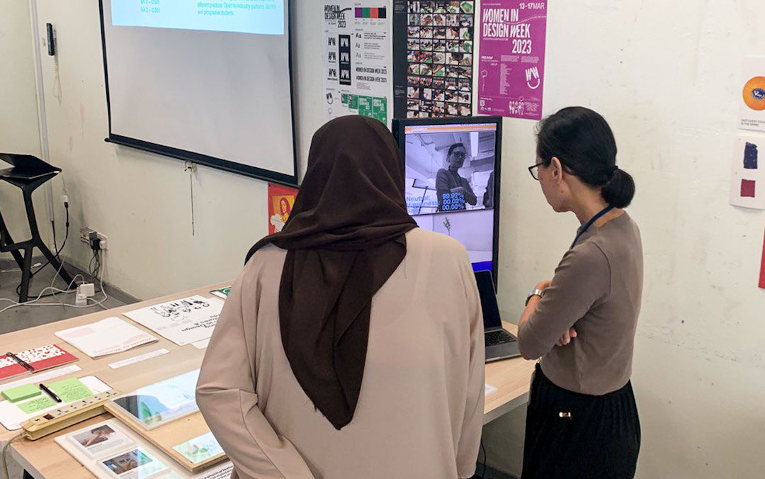
Images: (TOP) Myself with the desk setup for Open Studios, (BOTTOM) Class photo with our beloved lecturer, Andreas.
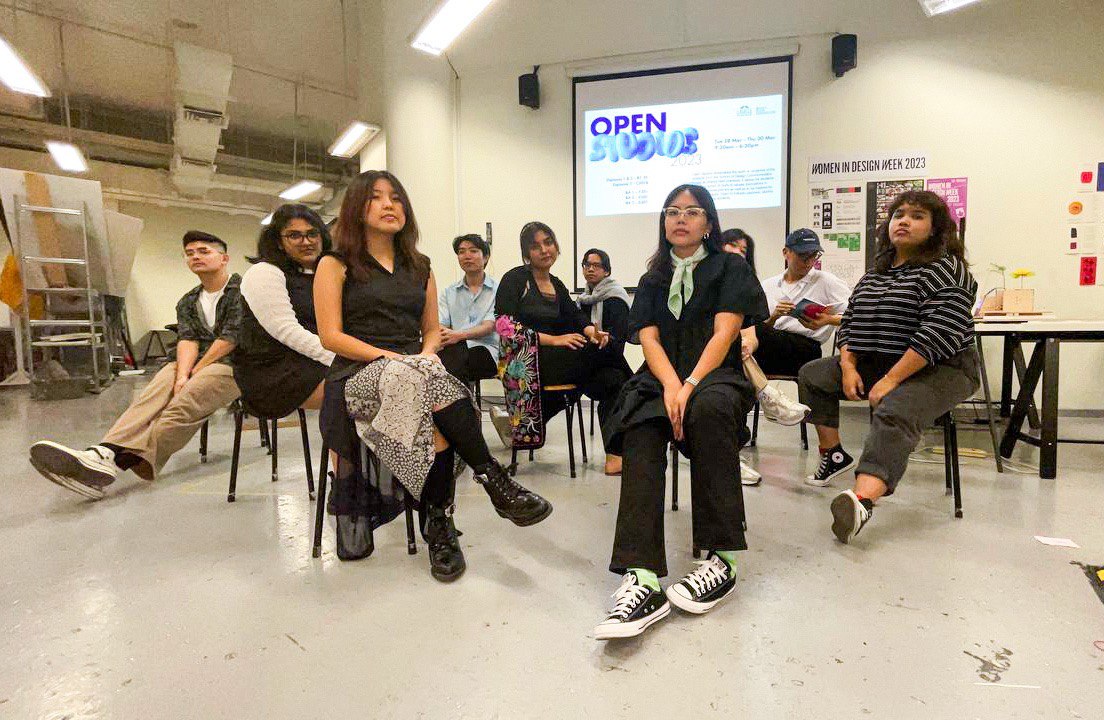
Image: Group photo with my closest group of friends.