Week 13: Consultation
Focusing on Art Direction
This week, we take a look at materiality, modularity and design language to create visuals that will aid in the story telling.
Material Play
Origami
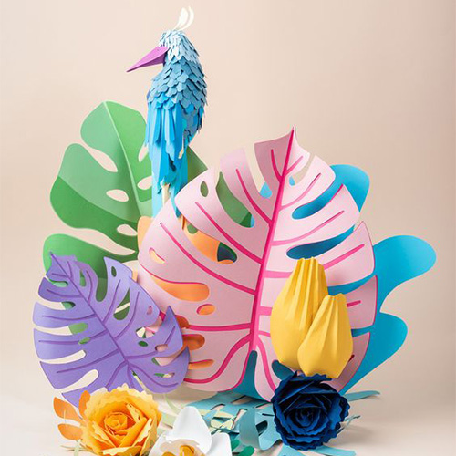
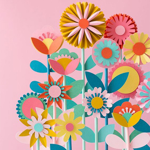
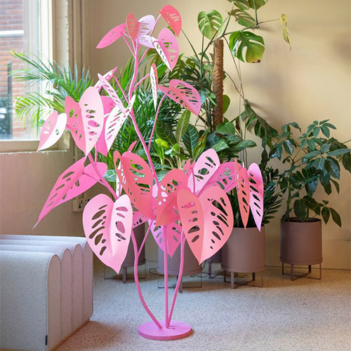
The design of the plants was a major point of conversation taken from last week's feedback. I personally also resonated with the fact that the design of the flower need to be thought of further rather than using off-the-shelf fake plants.
Paper might not be the best option since it'll probably tear and decay in the long run, durability will become an issue making cleaning the object difficult as more time passes.
But there is much to learn from the aesthetics of these images.
Acrylic
Shapey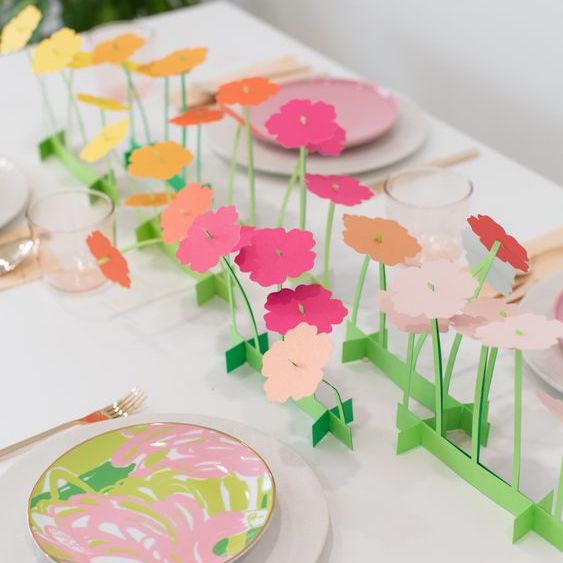
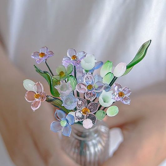
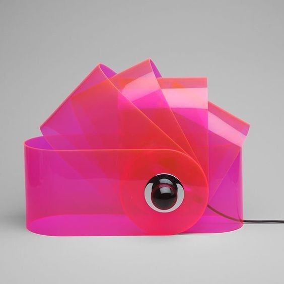
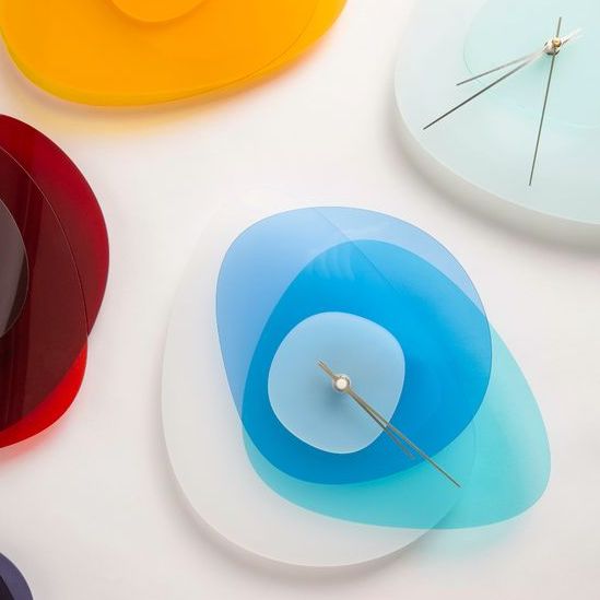
There's something intriguing about the layering of coloured acrylic, especially when different colours mix. However, to get a nice flower shape might be a little tricky, with a need for bending via heatgun to properly capture that petal look.
Modular Designs

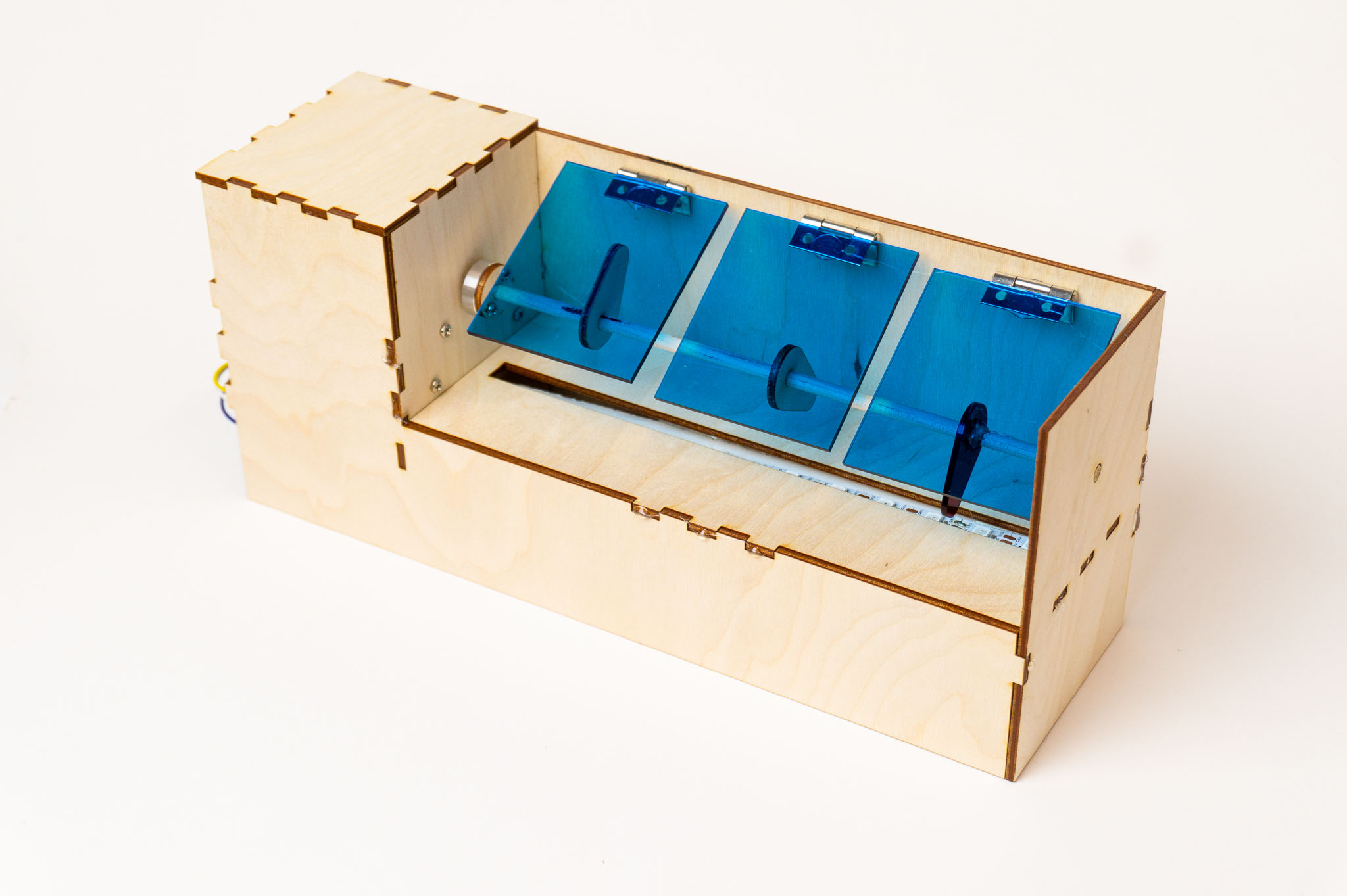
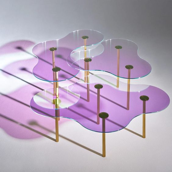
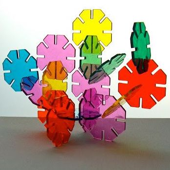
Another recurring comment was on the shape of the bodies. They were prominently boxy due to the limitations of laser-cutting which can only cut out on a 2D plane as opposed to 3D printing which, as in its name, can churn out more curvy shapes.
But these images above provide an interesting look towards more flowy shapes that can be implemented well with each other despite being flat shapes.
Design Language
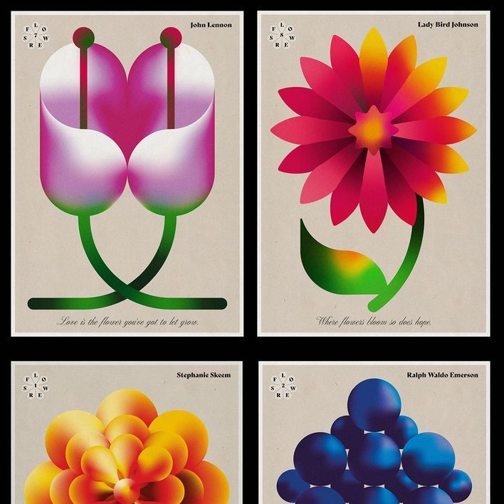
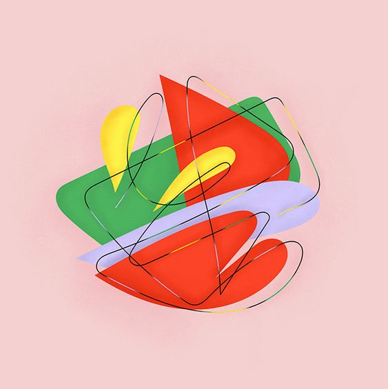
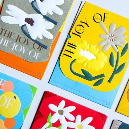
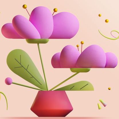
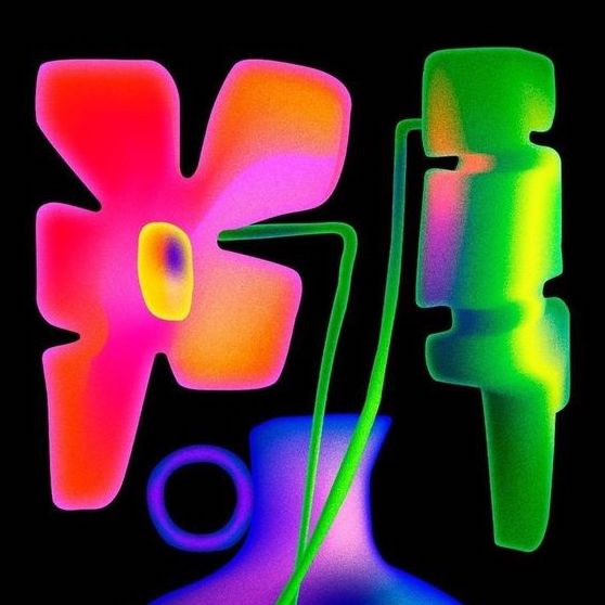

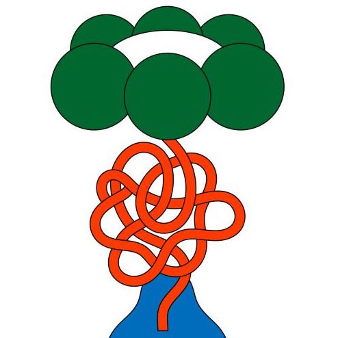
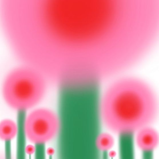
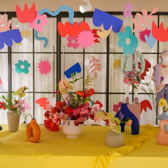
This serves to be a moodboard for further iterations on the Art Direction of the project.
Designs Inspired by the Above
Flower
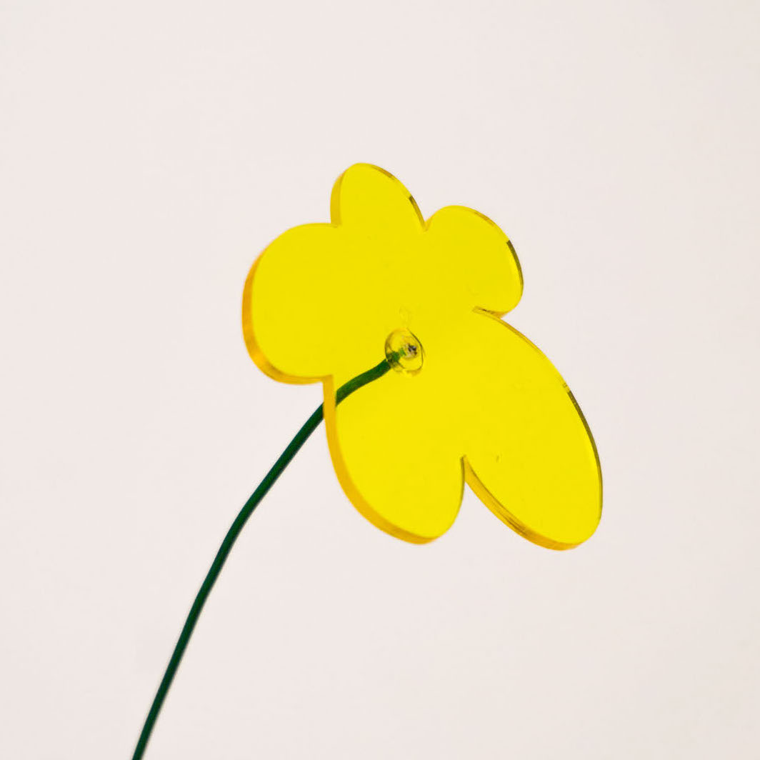
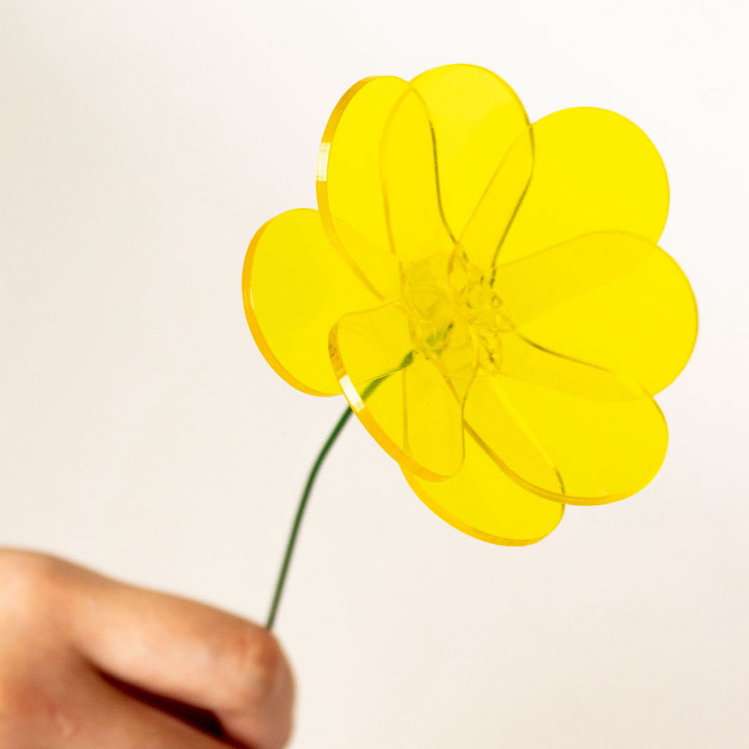
I came up with 2 designs for the flower based on the moodboarding. While the left flower is easy to cut and isn't very heavy, there's something inherently more interesting visually for the stacked right version that feels like a crime to ignore.